Table of Contents
ToggleChoosing the right paint colors for a commercial office isn’t just about aesthetics, it’s a strategic decision that affects employee morale, productivity, and client perception. A poorly chosen palette can make spaces feel cramped, sterile, or chaotic, while the right colors create environments where people actually want to work. Unlike residential painting, commercial projects require coordination with building managers, adherence to fire codes, and often weekend or after-hours work to avoid business disruption. This guide walks through proven color strategies for different office zones, helping business owners and facility managers make informed decisions that balance brand identity with functional design.
Key Takeaways
- Commercial office paint color ideas directly influence employee productivity, client perception, and brand identity—cool blues and greens reduce stress and improve focus, while warm neutrals foster collaboration.
- Choose eggshell finishes for main office walls and satin finishes for high-traffic areas like receptions and hallways, as they balance durability and cleanability better than flat or semi-gloss options.
- Use the 60-30-10 color proportion rule: 60% dominant color on main walls, 30% secondary color for trim and accents, and 10% bold accent color on doors or architectural details to maintain visual balance.
- Test paint samples on multiple walls throughout the day before committing, since fluorescent and LED lighting drastically alter color appearance—what looks warm may appear grayish under certain fixtures.
- Biophilic color palettes incorporating sage green, warm taupe, and earth tones align with wellness-focused workplace design and measurably reduce stress and improve cognitive function.
- Select 100% acrylic latex paints with GREENGUARD Gold certification to minimize off-gassing in occupied spaces and reduce re-occupancy time from 48 hours to 12-24 hours.
Why Paint Color Matters in Commercial Office Spaces
Paint color directly influences psychological responses in ways that impact workplace performance. Cool blues and greens reduce stress and improve focus, making them ideal for environments requiring sustained concentration. Warm neutrals create approachable, collaborative atmospheres. Bright accent colors stimulate creativity but can overwhelm if overused.
From a practical standpoint, paint selection affects maintenance costs and longevity. Commercial-grade paints typically last 5-7 years in high-traffic areas versus 10+ years in private offices. Lighter colors show scuffs and handprints more readily but make small spaces feel larger. Darker tones hide wear better but require more coats to achieve even coverage, expect to apply three coats minimum over existing dark walls when switching to lighter shades.
Color psychology varies by industry. Tech companies often use energizing blues and greens to signal innovation, while law firms lean toward traditional grays and navy tones that convey stability. Healthcare offices benefit from soft greens and blues that reduce patient anxiety. Consider your client base: if visitors spend time in your space, the color scheme becomes part of your brand experience.
Lighting conditions drastically alter how colors appear. Fluorescent lighting (common in commercial spaces) shifts colors cooler, making warm beiges look grayish. LED lighting at 3000-4000K color temperature provides the most accurate color rendering. Always test paint samples on multiple walls and observe them throughout the day before committing to gallons.
Best Paint Colors for Different Office Areas
Reception and Lobby Areas
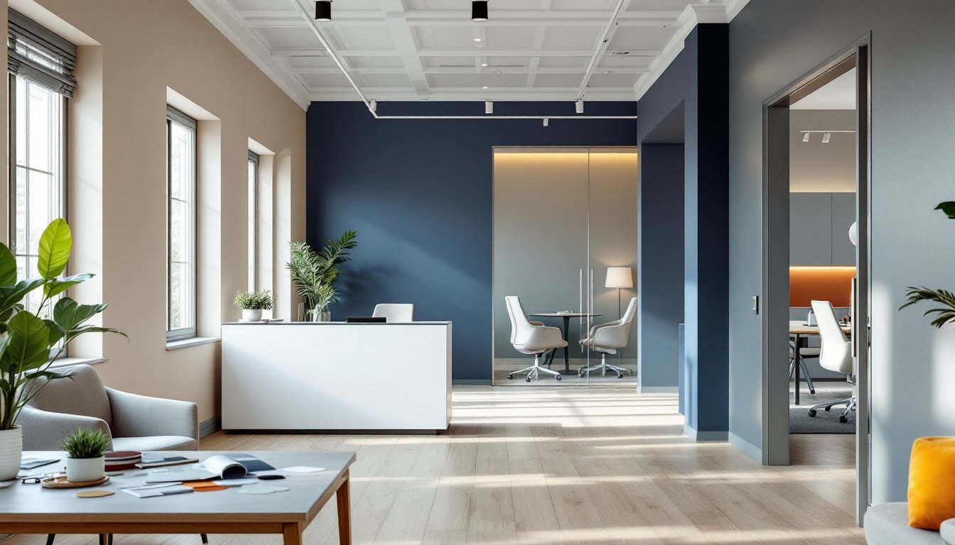
Reception areas set the tone for client interactions and should reflect brand identity while remaining welcoming. Bold accent walls behind reception desks create focal points, consider deep navy (SW Naval), charcoal gray (SW Peppercorn), or brand-specific colors. Pair these with neutral surrounding walls in warm whites or light grays to prevent overwhelming small lobbies.
Durability matters here. Use eggshell or satin finishes rated for commercial use, typically containing higher resin content than residential paints. These finishes withstand frequent cleaning from handprints on walls near door frames. For high-traffic lobbies, apply scuff-resistant additives or choose paints specifically formulated for commercial applications, they cost 15-20% more but reduce repainting frequency.
If your lobby has limited natural light, avoid pure white, which can appear stark under fluorescent fixtures. Warm off-whites like SW Alabaster or Benjamin Moore White Dove add subtle warmth. Conversely, south-facing lobbies with abundant sunlight can handle cooler tones without feeling cold.
Conference Rooms and Meeting Spaces
Conference rooms require colors that minimize distraction during presentations while keeping participants alert. Mid-tone grays and blues work well: they’re neutral enough for video conferencing (avoiding color cast on faces) but more engaging than stark white.
Avoid highly saturated colors on all four walls, they create visual fatigue during long meetings. Instead, use a three-wall neutral approach with one accent wall in a deeper tone. Popular combinations include light gray (SW Repose Gray) on three walls with slate blue (SW Distance) on the accent wall.
For rooms with projection screens or monitors, paint the wall behind the screen a matte medium gray to reduce glare and improve perceived contrast. Glossy finishes reflect light and create distracting hotspots during presentations.
Consider acoustics: while not a substitute for proper acoustic treatment, matte and flat finishes slightly reduce sound reflection compared to glossy sheens. If your conference room has echo issues, flat finish paint is one small component of a broader acoustic strategy.
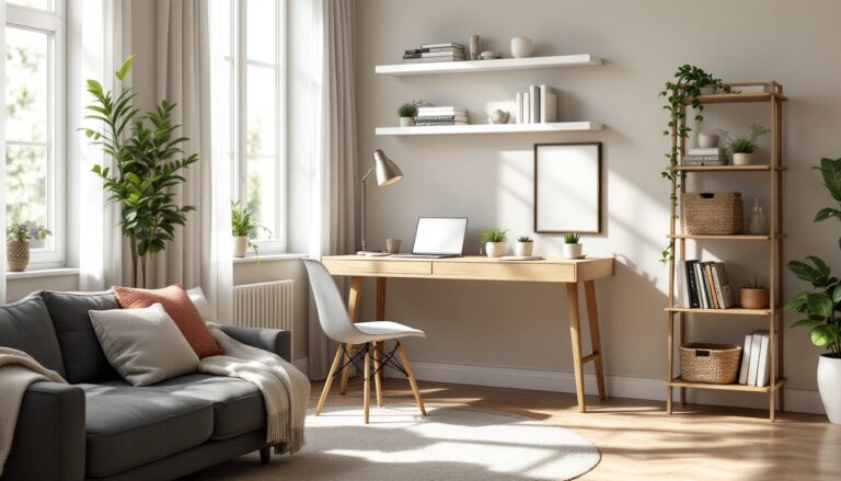
Individual Workstations and Open Floor Plans
Open offices present unique challenges, colors must energize without overwhelming, and they need to work across varied desk configurations. Soft neutrals in the greige family (gray-beige blends) provide versatility: SW Accessible Beige, BM Revere Pewter, or Sherwin Williams Agreeable Gray are workhorses in commercial settings.
Zone open plans with color to create visual boundaries without physical walls. Paint collaborative areas in slightly warmer or more saturated tones than individual focus zones. For example, designate breakout spaces with warm accent colors like terracotta or sage green, while keeping desk areas in cooler, calmer tones.
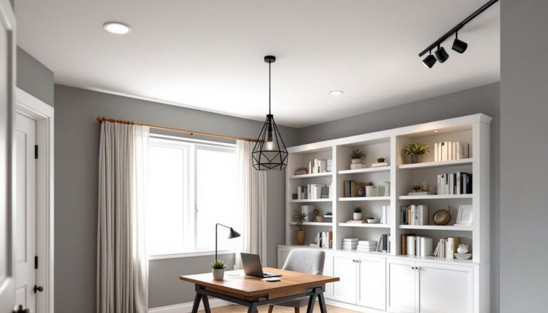
Ceiling color impacts perceived room height. Standard commercial ceilings run 9-10 feet: painting them bright white maximizes light reflection and makes spaces feel taller. In loft-style offices with exposed ductwork, painting ceilings dark gray or matte black recedes infrastructure visually, drawing attention to walls and workspaces instead.
For cubicle environments (though less common now), use lighter shades on upper walls and slightly deeper tones below the sight line. This prevents the “cave effect” while hiding chair-height scuffs and marks.
Popular Color Schemes for Modern Commercial Offices
Monochromatic gray schemes remain popular for their professional appearance and flexibility. Pair three shades from the same color family: light gray walls (SW Mindful Gray), medium gray trim (SW Cityscape), and charcoal accent walls (SW Iron Ore). This approach creates visual interest without clashing and works with virtually any furniture style.
Biophilic palettes incorporating greens and earth tones align with wellness-focused workplace design. Sage green (SW Clary Sage), warm taupe (SW Tony Taupe), and cream create calming environments that echo natural settings. Studies link biophilic design elements to reduced stress and improved cognitive function, color is one accessible entry point into this design philosophy.
Navy and warm white combinations deliver sophistication without feeling corporate-stuffy. Use navy (SW Naval or BM Hale Navy) on one accent wall per room, with warm whites or light beiges on remaining surfaces. This scheme particularly suits professional service firms, finance, consulting, legal, where gravitas matters but approachability is still valued.
Energizing accent schemes work for creative industries: advertising, design, tech startups. Establish a neutral base (light gray or warm white on 80% of surfaces), then introduce bold accent colors, mustard yellow, burnt orange, teal, on select walls or architectural features. Keep saturated colors to 15-20% of visible surfaces to avoid sensory overload.
Warm minimalism reflects 2026 design trends: creamy off-whites, warm grays with beige undertones, and occasional terracotta or rust accents. This palette feels contemporary without the coldness of stark white minimalism. SW Shoji White paired with SW Accessible Beige and terracotta accents exemplifies this approach.
Whatever scheme you choose, maintain 60-30-10 proportions: 60% dominant color (usually the lightest shade on main walls), 30% secondary color (trim, accent walls), and 10% accent color (doors, architectural details). This ratio creates visual balance and prevents any single color from overwhelming the space.
How to Choose the Right Finish and Paint Type
Flat or matte finishes hide surface imperfections best and reduce glare, critical for offices with abundant natural light or multiple monitors. But, they’re harder to clean and less durable. Reserve flat finish for low-traffic areas like private offices or ceilings. Modern “washable flat” formulations offer better cleanability than traditional flat paints but still can’t match higher sheens for scrubbing tolerance.
Eggshell finishes (10-25% sheen) strike the best balance for most commercial applications. They hide minor wall imperfections, offer decent cleanability, and don’t create distracting reflections. Use eggshell on main wall surfaces in offices, hallways, and conference rooms. Coverage typically runs 350-400 square feet per gallon depending on surface porosity and color transitions.
Satin finishes (25-35% sheen) provide excellent durability and washability for high-contact areas: door frames, hallways, reception areas, and any surface within three feet of the floor. The slight sheen highlights surface defects, so proper wall prep, filling nail holes, sanding patches smooth, priming stains, becomes critical. Skip prep steps, and every flaw will show under office lighting.
Semi-gloss works for trim, doors, and areas requiring frequent cleaning or moisture resistance (break rooms, bathrooms). It’s too reflective for large wall surfaces but provides the hardest, most scrubbable finish for detail work.
Choose 100% acrylic latex paints for commercial offices. They offer better adhesion, flexibility, and durability than vinyl-acrylic blends. Look for products meeting GREENGUARD Gold certification or similar low-VOC standards, crucial for occupied spaces where off-gassing affects air quality. Standard paints require 24-48 hours before re-occupancy: low-VOC formulations reduce that to 12-24 hours.
For concrete or previously unpainted drywall, apply primer first. Tinted primer (tinted toward the finish color) reduces the number of topcoats needed, especially when making dramatic color changes. When painting over dark colors, use a stain-blocking primer like Zinsser Cover Stain or BIN to prevent bleed-through.
Calculate material needs accurately: measure wall area (length × height), subtract windows and doors, then divide by coverage rate. Add 15-20% extra for waste, touchups, and future repairs. Commercial buildings often require specific paint documentation for warranty purposes, keep receipts, color formulas, and batch numbers on file.
Most commercial painting requires working around occupied spaces. Coordinate with building management about after-hours access, ventilation requirements, and fire system protocols. Some jurisdictions require painters to carry specific licensing and insurance for commercial work, verify local requirements before hiring contractors or tackling projects in-house.
PPE matters: Use respirators (not just dust masks) when spraying or working in poorly ventilated areas, safety glasses to prevent splatter injuries, and gloves to avoid skin contact with wet paint. Proper ventilation, opening windows, using fans, accelerates drying and reduces VOC exposure even with low-odor paints.