Table of Contents
ToggleCabinet color might be the single most impactful decision in a kitchen renovation. It sets the mood, dictates countertop and backsplash choices, and influences every finish that follows. Unlike countertops or flooring, which often carry hefty price tags, cabinets can be refreshed with quality paint and effort, making color changes accessible to most DIYers. Whether planning a full gut or a weekend refresh, understanding how color choices interact with lighting, hardware, and existing architecture prevents costly missteps. This guide walks through proven color palettes, combinations, and finish types that hold up to real-world kitchen use.
Key Takeaways
- Cabinet paint color ideas dictate the mood of your kitchen and influence all subsequent design choices, making it the most impactful decision in any renovation.
- Warm cabinet colors suit north-facing kitchens while cool tones work better in south-facing spaces; always test paint samples under both natural and artificial light.
- Satin finish is the most versatile cabinet paint option, balancing easy maintenance, subtle sheen, and durability across all color choices and design styles.
- Two-tone cabinets with darker lowers and lighter uppers add architectural interest while hiding wear in high-traffic areas near sinks and stoves.
- Navy blue and forest green are among the most popular kitchen cabinet paint colors, offering personality without the maintenance demands of pure black.
- Test cabinet colors on actual cabinet doors for at least three days before committing to ensure they work with your lighting, countertops, and overall kitchen layout.
Why Cabinet Color Matters More Than You Think
Cabinets typically occupy 30–40% of visible wall space in kitchens, making them the largest color field in the room. That surface area creates an anchoring effect: warm tones make spaces feel intimate, cool tones open them up, and high-contrast choices add architectural definition where none existed.
Paint also changes how natural and artificial light behave. North-facing kitchens with cool daylight benefit from warmer cabinet tones to counteract gray casts, while south-facing rooms can handle cooler palettes without feeling sterile. Undercabinet LED strips (typically 3000K to 4000K color temperature) will shift how paint reads at night, test samples under both conditions.
From a practical standpoint, cabinet color affects maintenance visibility. Gloss and semi-gloss finishes on darker colors show fingerprints and watermarks more readily than matte or satin finishes on mid-tones. Lighter colors camouflage dust but highlight grease splatter near the range. There’s no perfect universal choice, but understanding these trade-offs prevents regret six months in.
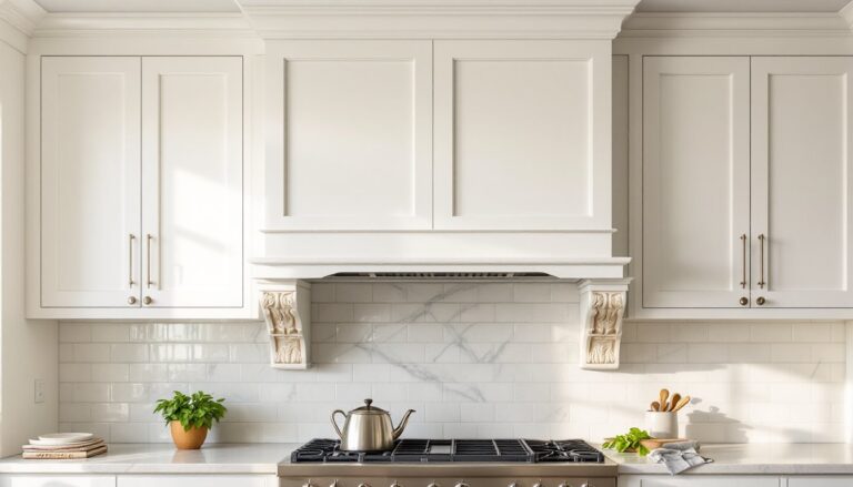
Timeless White and Neutral Cabinet Colors
Classic Whites
Pure white (often labeled as “extra white” or “ultra white” by manufacturers) offers maximum light reflection and pairs well with stainless steel appliances and marble countertops. It’s the go-to for Scandinavian and modern farmhouse aesthetics. But, pure whites can read sterile in kitchens lacking natural wood or texture, consider adding warmth through brass hardware or wood open shelving.
Warm whites with cream or yellow undertones (often called “Swiss coffee” or “linen white”) soften the clinical edge and complement traditional cabinetry with raised panel doors. These work especially well in homes with oak or maple flooring, where a stark white would create too much contrast.
Greige and True Grays
Greige, a gray-beige hybrid, has dominated the neutral cabinet space since the mid-2010s and remains a safe, resale-friendly choice. It pairs with virtually any countertop material and tolerates mixed metal finishes. Look for greiges with balanced undertones: some skew lavender in certain light, which clashes with warm wood tones.
True gray cabinets in medium tones (think charcoal diluted 50%) add sophistication without the commitment of black. They pair well with white quartz countertops and subway tile. Avoid cool grays in kitchens with builder-grade honey oak trim, the temperature clash will feel dated. Many budget renovation projects successfully use gray as a bridge color between old and new finishes.
Warm Beiges and Taupes
Beige has returned after years in the design wilderness, but the 2026 versions are more complex. Look for taupe tones with gray or mushroom undertones rather than flat builder beige. These colors work beautifully in kitchens with natural stone countertops like soapstone or leathered granite, and they’re forgiving with grease and wear.
Bold and Dramatic Cabinet Color Choices
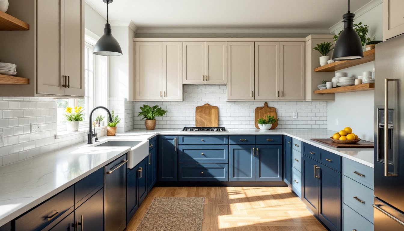
Deep Blues and Navies
Navy blue cabinets bring richness without the starkness of black. They read nearly neutral in low light but show color depth when the sun hits. Navy pairs exceptionally well with brass or gold hardware and butcher block countertops. It’s a proven choice for traditional shaker-style cabinets and works in both coastal and transitional kitchens.
Slate blue or muted teal offers a softer alternative with similar versatility. These mid-tone blues complement both warm and cool palettes and don’t show wear as readily as very dark finishes.
Forest and Sage Greens
Forest green cabinets create a moody, organic feel that pairs well with natural materials, think marble, wood beams, and terracotta tile. This works especially well in kitchens with ample natural light or in homes with a cottage or English country aesthetic. Among the most popular kitchen cabinet paint colors, rich greens have emerged as a confident alternative to neutrals.
Sage green, softer and grayer, fits modern farmhouse and Scandinavian-inspired kitchens. It’s less intense than forest green but still adds personality. Both greens work best with white or light stone countertops to prevent the space from feeling cave-like.
Black and Charcoal
Black cabinets demand commitment. They work in kitchens with excellent natural light, high ceilings, or as part of a high-contrast design (black lowers, white uppers). Use a high-quality acrylic enamel paint to prevent chalking and provide a durable surface. Expect to touch up more frequently than lighter colors, black shows every fingerprint, drip, and scuff. Matte black finishes hide imperfections better than satin but are harder to clean.
Two-Tone Cabinet Color Combinations
Two-tone cabinets add architectural interest and solve design problems, like making a kitchen with a poorly placed island feel more intentional or adding depth to a flat, galley layout.
Classic Combinations
White uppers with navy, gray, or black lowers is the most popular two-tone formula. It keeps the upper portion light and airy while grounding the space with darker lowers that hide wear near the floor. This approach works in kitchens of any size.
Natural wood uppers with painted lowers bridges traditional and modern styles. Oak, walnut, or maple uppers (stained or clear-coated) add warmth, while painted lowers in white, gray, or sage modernize the look. This combination shows up frequently in contemporary interior design projects that balance warmth and minimalism.
Bold Contrasts
Navy lowers with white or light gray uppers creates a nautical or transitional feel without going full navy. It’s easier to live with long-term than all-navy cabinets and pairs well with marble or white quartz.
Green lowers (sage or forest) with warm white or cream uppers works beautifully in farmhouse or English cottage kitchens. Add brass or bronze hardware to tie the tones together.
Application Tips
When planning two-tone cabinets, use the darker color on lower cabinets or the island, areas that naturally see more wear. If your kitchen has a peninsular or L-shaped layout, carry the darker color all the way around the base to create continuity. Avoid splitting colors mid-cabinet or on a single cabinet face unless you’re creating an intentional accent moment (like a painted hutch or pantry door).
Matching Cabinet Colors to Your Home Style
Modern Farmhouse
Stick with warm whites, greiges, or sage green for cabinets. Pair with shaker-style doors, open shelving, and mixed metals (matte black faucets, brass drawer pulls). Butcher block or honed marble countertops complete the look. Avoid high-gloss finishes, satin or matte reads more authentic.
Traditional and Transitional
Warm whites, taupe, or navy work well with raised-panel cabinet doors and classic crown molding. Pair with granite or marble countertops and polished nickel or brass hardware. If going with navy or dark colors, ensure adequate lighting, traditional kitchens often have fewer windows.
Coastal
Soft blues, aqua, or crisp white cabinets suit coastal aesthetics. Pair with white subway tile, quartz countertops, and brushed nickel or chrome hardware. Shiplap or beadboard backsplashes reinforce the theme. Avoid heavy, dark colors that contradict the breezy coastal vibe.
Contemporary and Minimalist
True gray, black, or high-contrast two-tone (white and black) cabinets fit sleek, modern kitchens. Use slab-door cabinets (flat, no frame or panel detail) and integrated pulls or touch-latch hardware. Pair with quartz or solid-surface countertops and minimize decorative elements. High-gloss finishes work here if you’re prepared to maintain them.
English Cottage and Vintage
Forest green, slate blue, or warm cream cabinets with inset doors and cup pulls or bin pulls create an authentic vintage feel. Pair with butcher block, soapstone, or distressed wood countertops. Open plate racks and glass-front upper cabinets enhance the cottage aesthetic.
Tips for Choosing the Right Cabinet Paint Finish
Finish selection is as important as color. The wrong sheen makes even the best color fall flat, or worse, shows every flaw.
Matte and Flat Finishes
Matte finishes hide surface imperfections, brush strokes, and minor dings better than any other sheen. They also offer a sophisticated, modern look that’s especially popular in European-inspired kitchens. But, matte is the hardest to clean, grease and moisture can leave permanent marks if not wiped quickly. Reserve matte for upper cabinets or low-traffic areas.
Satin Finish
Satin is the workhorse finish for cabinets. It offers subtle sheen, hides imperfections reasonably well, and wipes clean without leaving streaks. Most cabinet-grade paints (Benjamin Moore Advance, Sherwin-Williams Emerald Urethane) are formulated for satin application. It works on both light and dark colors and suits any design style.
Semi-Gloss Finish
Semi-gloss is the most durable and scrubbable option, making it ideal for lower cabinets near the sink and stove. The higher sheen reflects more light, which can make small kitchens feel larger, but it also highlights any surface flaws or uneven brush work. If DIY painting, proper surface prep (sanding, priming, and using a quality brush or HVLP sprayer) is critical for a smooth result.
High-Gloss Finish
High-gloss (often achieved with lacquer or specialty enamel) creates a mirror-like, ultra-modern look. It’s the most durable but the least forgiving, every drip, streak, and dust speck will show. High-gloss application typically requires spraying rather than brushing for professional results. Use this finish only if you’re committed to frequent cleaning and touch-ups.
Safety and Application Notes
Always apply cabinet paint in a well-ventilated area. Wear a respirator rated for organic vapors (not just a dust mask) when using oil-based or lacquer products. Use eye protection and nitrile gloves. Allow adequate cure time, most water-based cabinet paints can be handled after 24 hours but don’t fully harden for 7–14 days. Avoid stacking dishes or slamming doors during the cure period.
Conclusion
Choosing cabinet paint colors involves balancing personal taste, existing finishes, and long-term livability. Test samples on actual cabinet doors in the space, observe them under different lighting for at least three days, and consider how the color interacts with countertops, flooring, and wall colors. A well-chosen cabinet color transforms not just the kitchen but the entire flow of the home, making it one of the highest-value investments a homeowner can make, whether DIYing or hiring out.